
Best Practices for Olive Oil Package Design
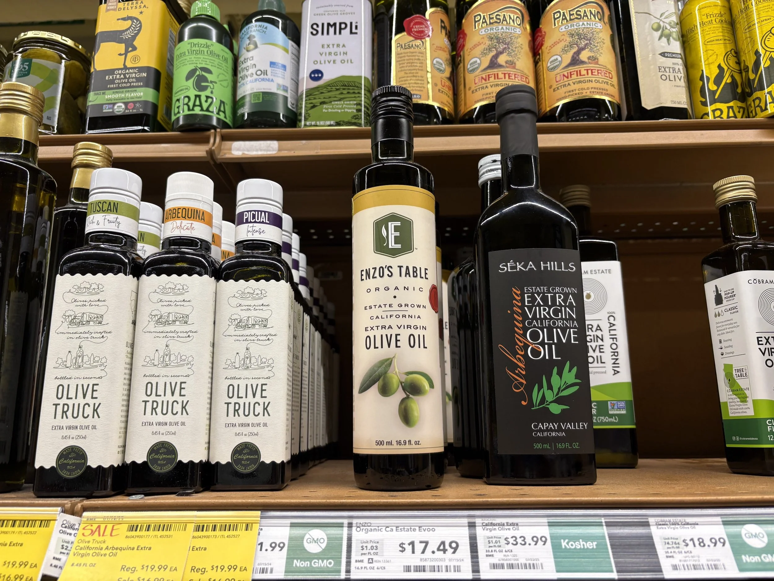
Olive oil bottles on supermarket shelf
Good packaging can communicate a lot before the bottle is even opened. The label is not just decoration. It is the first chapter of the product's story. To learn some best practices, we travel to California and two areas of Italy. Gold Ridge Organic Farms is located in Sebastopol, California. North of San Francisco, Sebastopol shares the environs with the coastal area of Bodega Bay to the west and the famous wine region of Sonoma-Napa-St. Helena to the east.
Our Italian farms are Fonte di Foiano, in Coastal Tuscany, along the Tyrrhenian Sea and just south of Bolgheri, noted for the famous Brunello wines. Our southern Italian farm, Tenute Librandi is sited deep in Southern Calabria, where the arch of the boot meets the Ionian Sea.
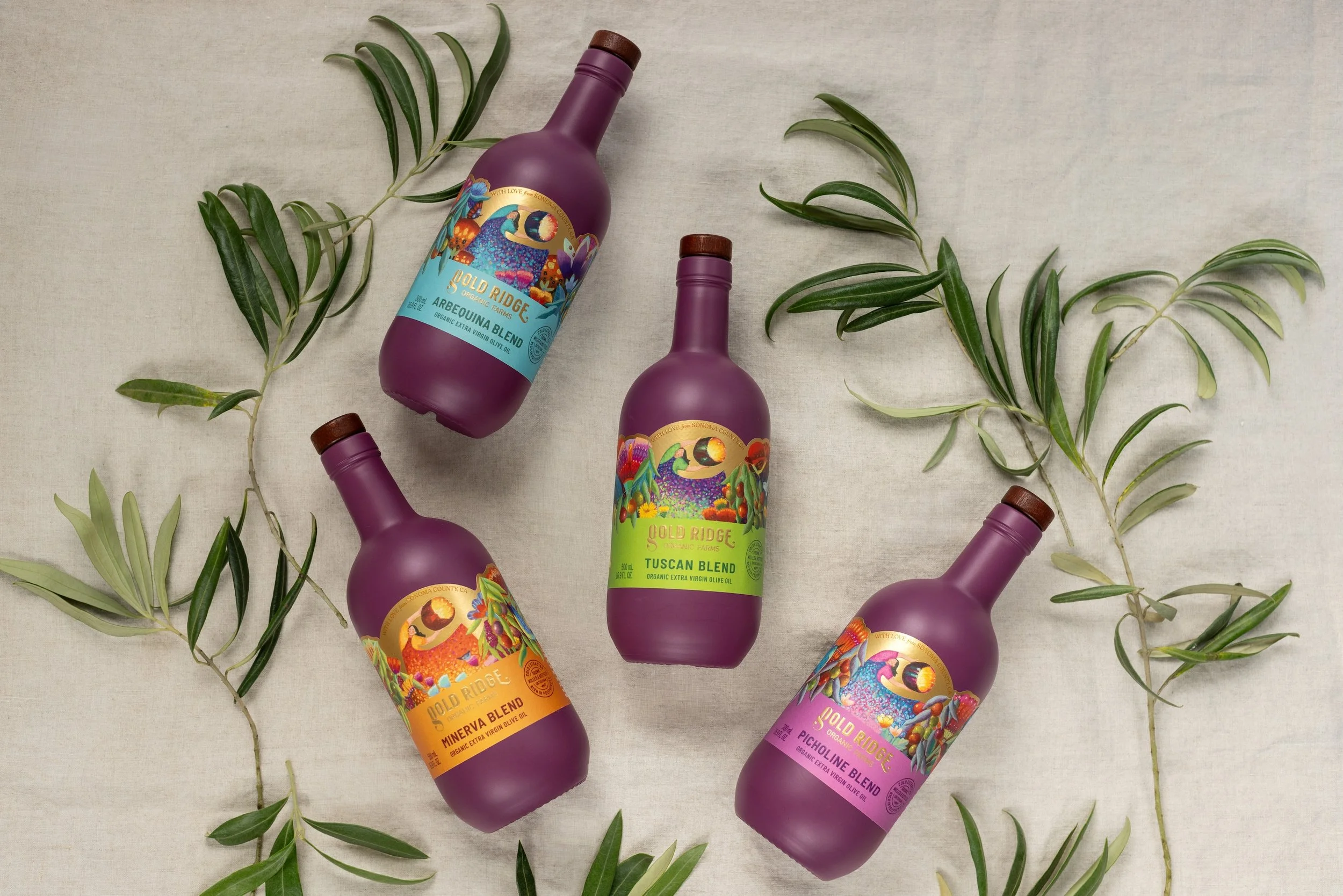
Gold Ridge olive oil bottles photo credit paige green photography
Gold Ridge Organic Farms
Whimsy
Color
Attention to bottle shape, bottle color and bottle design to complement the label
The farm is the dream of Farmer Brooke Hazen, a California native, his goal was to grow nutritious, organic foods for the community. In 2000, he took the next step in his dream to purchase 88 acres of California land, in Sebastopol, where he planted orchards with olives, apple and citrus trees – launching Gold Ridge Organic Farms.
In a word, the new designs of Gold Ridge Organic Farms are whimsical. Colorful, artistic, and playful messages are conveyed dramatically through the bottle shape, bottle color, design, and labels.
Gold Ridge bottles and labels have recently been redesigned with expressive, whimsical and mystical saturated and rich color combinations. In a design process that took about a year, the new labels tell the story of the farm on the bottle with visions arising from Farmer Brooke’s design sensibility. Terri Sloat, an artist famous for her traditional and narrative folk art styles was first commissioned to create a mural called Abundance for the tasting room at the farm. Her work was so important to the farm store that she was asked to expand her designs to the labels for the bottles.
Considering the broad range of bottles in the olive oil world, Gold Ridge’s bottle is the most innovative. It is a painted bottle. Sourced in Italy and painted deep purple (Pantone 235U) in the U.S. Midwest, the bottles are filled and labels are applied at the farm.
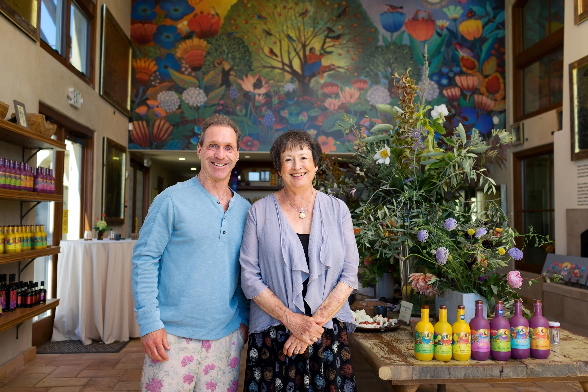
Gold Ridge Organic Farms Farmer Brooke and artist, Terri Sloat, who designed both the mural and the labels for the bottles. Photo credit paige green photography.
Brooke Hazen, farmer-owner Gold Ridge Organic Farms, shares, “The purple bottle was a very intentional choice—it reflects the color we look for in the olives at harvest and creates a connection between the orchard and what you see on the table. "
"We wanted the artwork to tell the larger story of Gold Ridge: the abundance, color and life of the farm. The packaging is really an invitation into that world.”
Layered on the gorgeous purple bottles, the labels tell the story of the farm. The production of the label is somewhat arduous with artwork, embossing, gold foil, and a last pass on the printer for “with love from Sonoma County.” The textured and coated paper label is printed with colorful inks, and gold metallic is added as the last layer on the labels.
The painted bottle with the colorful artistically detailed label sends a dramatic and enthusiastic message – oh, wow! This has personality. The warm wood caps are part of the design – wood with cork, enclosed with a clear capsula for a finished look and protection. Together the capping method compliments the golden and earthy tones on the label.
Each label possesses the same imagery presented in a different color combination. The line includes four extra virgin olive oils and three citrus oils.
Picholine: features a deep raspberry color on the label. The cultivar is a French olive, known to be robust and lightly fruity. Picholine is somewhat rare in California.
Minerva: stands out with a golden-orange dominant label. Minerva is a unique and patented cultivar with Frantoio, Moraiolo, Cerasuola, and Ladoeli olive strains. It is known to be full-bodied and balanced with a mild peppery finish.
Tuscan Blend: the label dominates with lovely citrus green indicating a bright and complex oil, with notes of green fruits and nuts, finishing both robust and pungent.
Arbequina: a deep aqua teal grabs the consumer’s attention for this oil. The cultivar is a native of Spain and the selection is lighter and buttery.
The classic extra virgin olive oils are bottled in 500 ml, while the farm’s (unique) citrus and apple combinations are presented in coordinating 375 ml painted bottles. To date, the new labels are only on the bottles. Gold Ridge’s tins carry the former labels – attractive graphic elements without art. Read more about Gold Ridge Organic Farms olive oil.
Fonte di Foiano
Quality
Modern, clean lines
Consistency with wine labels
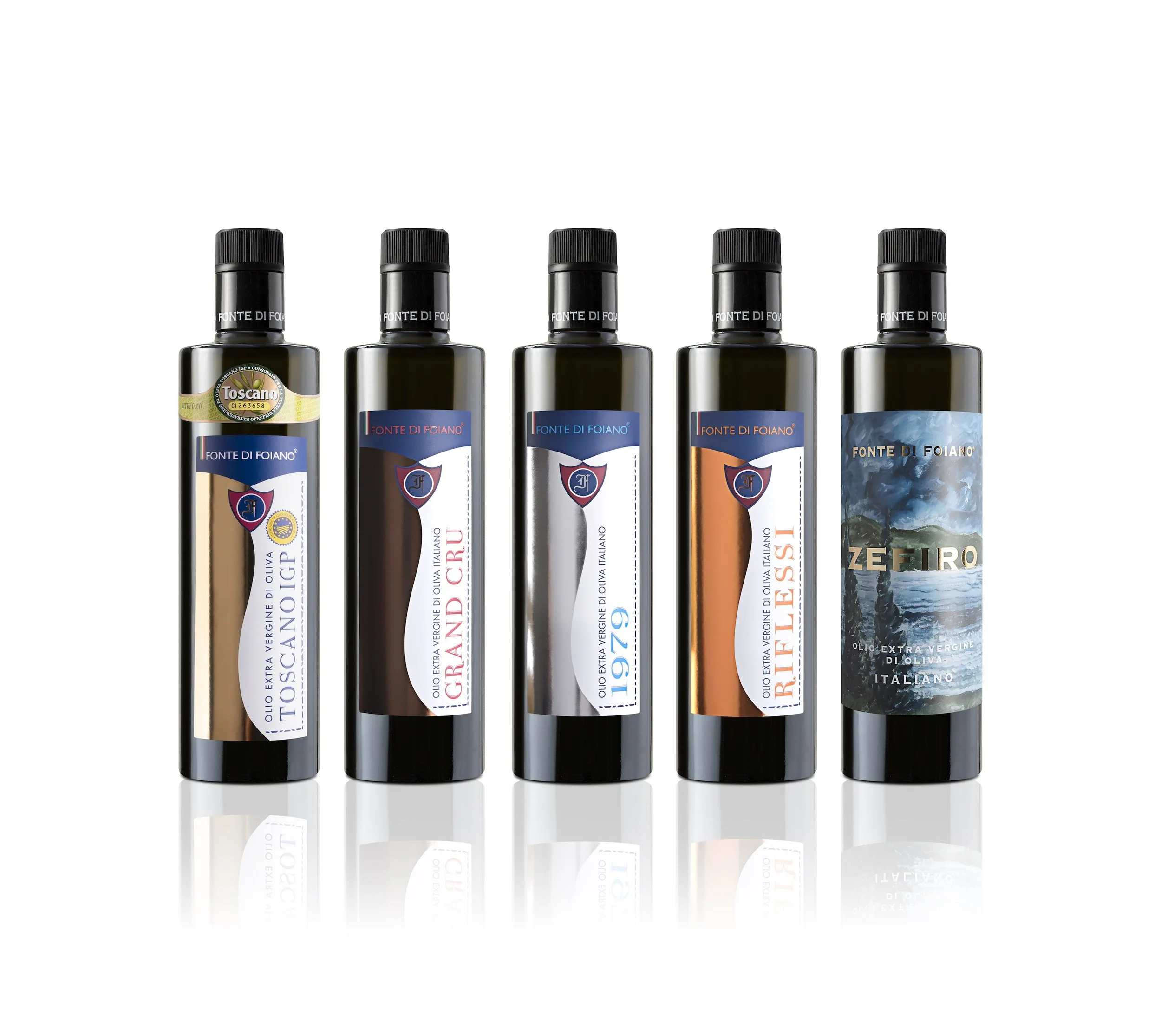
Fonte di Foiano labels with square shouldered bottles, strong and modern. Photo credit Fonte di Foiano
Fonte di Foiano’s groves rest on broad hillsides facing east to greet the Tyhrenian Sea with each morning’s sunrise. The breezes gently stir the olives as they grow abundantly on the trees. Where the trees grow, tended by brothers Paolo and Simone di Gaetano, their sister Beatrice’s Farmhouse restaurant serves vegetarian fare featuring the family’s extra virgin olive oil selections on the menu and the tables.
Located just south of Bolgheri, and just north of the “town” of Castagnetto Carducci, brothers Simone and Paolo re-designed the label in 2015. As new cultivars are grown to adjust to changing climate and growth patterns, this label design can be expanded with a color pallette to reflect the differences in these very special olive oils.

Riflessi bottle with burrata salad photo credit Luanne Savino O’Loughlin
When it was time for a change, the siblings aimed for a bit of modernity, feeling that the prior label series was too tied to the past. The new labels reflect the serious quality and consistency – patterns also emphasized within the wine labels of this famous region.
The goal is for the bottles to be elegant and modern, adaptable to the farm’s bottling line, and thus they have chosen a bottle that is both cylindrical and square – with the square aspect at the “shoulders.”
The label designs are a careful selection of paper and metal foil, combined in appearance with the cap chosen for the best security for the precious oil inside. The goal was clean, not confusing, graphics.
The dominant graphic is a column of metallic in (gold, silver, copper) and the name of each product is displayed as on a book binding on the right side of each label. A heraldic shield meets the color alignment near the top of the label.
Paolo reflects, “The design process is expensive yet worthwhile as the label will be used for many years, maybe forever. It is an investment in the future of the company.”
The premium products, Grand Cru, 1979, Riflessi, and IGP Toscano adhere to the new series look. There are two additional versions of the IGP Toscano label. For specific bottlings and markets: The Tree of Life label is the most historic within the family and is often selected for export. IGP Toscano Bolgheri is a newer product, with a smaller defined production area.
Grand Cru: Gold label, exquisite Picholine, milled in a rich, robust style
1979: Silver label, Leccio del Corno olives, noted as the year the farm was founded
Riflessi (reflections): Copper label, first harvest in 2015, 100% Maurino olives
IGP Toscano (lighter gold) Frantoio, Moraiolo, and Leccino olives
IGP Toscano, Tree of Life for specific markets, aka “Blue Tree Label”
IGP Toscano Bolgheri: 100% Frantoio olives, distinctively patterned
Zefiro (Zephyr): 100% Ravece olives, a very special label based on seascape painted by the (deceased) founder
There have been a few refinements to the line since the current labels were designed. The bottle shape now has square shoulders, a distinctive design choice that modernizes the product. The cap’s collar carries text with Fonte di Foiano in upper case serif letters surrounding the collar. Above the main label there is space for the required series data on IGP Toscano labels. For the other bottles, a smaller label denoting “Since 1979” has a home in the same space.
Paolo adds, “Passion first is the most important thing we want people to know about our product and our brand. Modern and elegant are the goals for the shop’s displays as well as for ecommerce.”
Fonte di Foiano was founded by their father in the late 1970s. In his later years, he enjoyed painting in retirement. His last painting, a sea scape, featured on the elite selection, Zefiro.
Tenute Librandi
Easy identification
A cohesive collection
Using history and heritage

Tenute Librandi — three monocultivar selections, showing the detail of the newly designed bottles
Tied to the community, the Librandi family has resided in Vaccarizzo Albanese for five generations. Walk the streets of the town, and you’ll quickly realize the importance of the arrivals of the Albanese people (named Arbëreshë) in the 15th Century. Throughout this town in Calabria, signage carries both Arbëreshë and Italian street names. The family is prominent in this town of 1,000. Tour the Catholic Church with Byzantine Rite and note the symbols evident in the church are now represented on the labels. From the hillsides to the broad beach along the Ionian Sea, the Librandi family has coordinated products and a series of labels to encompass seven olive oil cultivars and blends. Trees on their land also grow lemons, oranges, and clementines perfectly for marmalades carrying labels with the same design elements as the extra virgin olive oils. Easily recognizable, these labels entice repeat and gift purchases.
When Olio Librandi made a change, they made a big, graphic change. We spoke to Michele Librandi about the changes made together with his siblings Angela, Carmella, Lucia, and Pino.
Tenute Librandi’s challenge involved a variation on a theme—each product needed a separate identity within a collection.
According to Librandi, “The project was not simply about giving the bottles a new graphic appearance. We wanted to create a visual identity that could express who we are as a company and, at the same time, make each individual cultivar immediately recognizable.”
First, they considered their location in Vaccarizzo Albanese, a town with a strong Arbëreshe cultural identity. The result clearly combines history, geometry, and contemporary design—meets the goal of differentiation, without creating labels that look nostalgic or overly traditional.
“We wanted consumers to understand that there is a real story behind the bottle: a family business, a specific territory, organic agriculture, our own olive groves and our own olive mill.” The collection communicates premium quality, authenticity, and craftsmanship rather than luxury for its own sake.

Tablescape with Tenute Librandi bottles photo credit Luanne Savino O’Loughlin
For wholesale buyers and retailers, recognition, consistency, and distinctive premium product positioning are particularly important. When a range is displayed on a shelf, Olio Librandi bottles must look like they belong together, while each product remains clearly identifiable. The modern label designs were expanded to the line of marmalades: lemon, clementine, and orange. As the labels were redesigned, the Librandi siblings focused on attracting customers’ curiosity with a thought to evolving the identity that customers recognize with a contemporary visual language.
Nocellara del Belice, monocultivar, features a motif from the church and combines nature with cultural heritage
Carolea, monocultivar, is clean and graphic, with the reversed “C” as its defining symbol
Giarraffa, monocultivar is stronger and more heraldic, noted by a shield
Frantoio, monocultivar is architectural and sophisticated featuring a center diamond
Dradista, a blend with intensity, is rhythmic and decorative, with overlaid circles and diamonds reflecting its identity as a blend
Piepo, a blend of several cultivars, is balanced and harmonious. Positioned as an everyday oil, the motifs fit the range with a simpler black and white label
Appena Franto, the first of the harvest, graphic olive green signaling energetic and fresh.
When the bottles are placed together, the relationship between them is immediately apparent. The use of geometry, strong contrasts, carefully selected color palettes and references to the local artistic heritage creates a recognizable Tenute Librandi visual identity. One collection, different personalities: unity without uniformity.
For Tenute Librandi, the material balances aesthetics with practicality. A label should feel good in the hand, display the artwork accurately and maintain a clean appearance throughout the life of the product. Adhesion and resistance to humidity are particularly important because olive oil bottles are used in kitchens, restaurants and food shops. The cap must be consistent with the perceived quality of the product. Its color, material and proportions can either reinforce the label or create visual confusion. The bottle, label and closure serve as one composition rather than designing each element independently. Every technical choice serves the overall identity of the bottle.
Typography is important to direct contemporary clarity with a sense of history. The typography defines the cultivar and renders the brand immediately readable, particularly when the bottles are viewed together on a shelf. Tenute Librandi deliberately avoided an excessively ornate or traditional typeface, allowing the historical references present in the geometric artwork to lead the typography. Throughout the line, ancient cultural references are interpreted through a modern design language.
Consumers increasingly want to know more than simply whether an olive oil is good. They want to know where it comes from, who produces it, what makes it different and why they should choose one bottle over another. Good packaging can communicate all of that before the bottle is even opened. For us, the label is therefore not decoration. It is the first chapter of the product's story.
The labels were designed to work particularly well in environments where consumers have time to look at the products: specialty food shops, delicatessens, restaurants, gourmet stores, and wine shops. This is especially important for specialty retailers, where packaging plays a significant role in attracting attention and initiating a conversation with the consumer. In this world with social media and ecommerce sales to you consider how each appears when This was an important practical and creative decision.
The idea was not simply to create different decorations for different oils. Each pattern has its own character and creates a different emotional association with the product.
Librandi closes with, “We want people to understand that Tenute Librandi is a family business with deep roots in the territory. Our olive growing has developed over generations, and since 1997 we have chosen organic agriculture. We manage our own olive groves and have our own olive mill, allowing us to control the process from the olives to the finished bottle. The label is therefore a way of connecting the consumer with that territory. We want someone in New York, Tokyo or Milan to look at the bottle and immediately understand that this is not an anonymous product: it comes from a real place, a real family and a specific cultural tradition.”
All selections are available in the US.